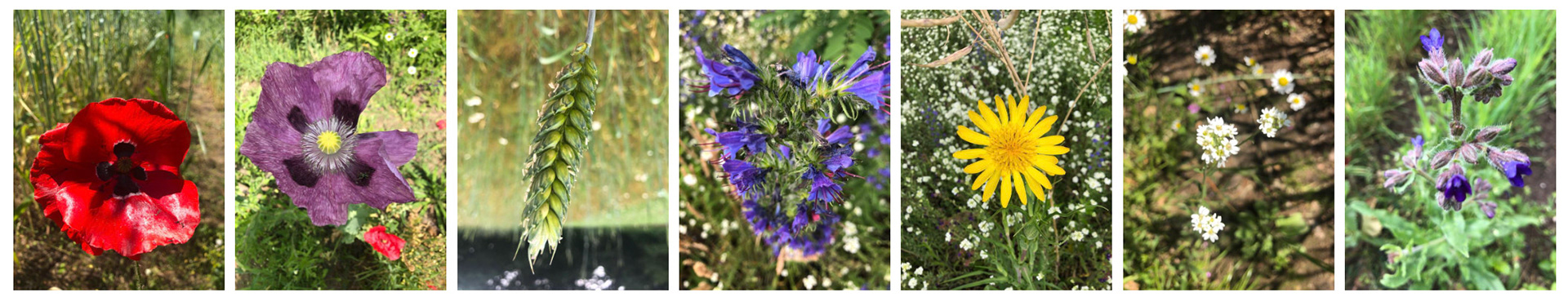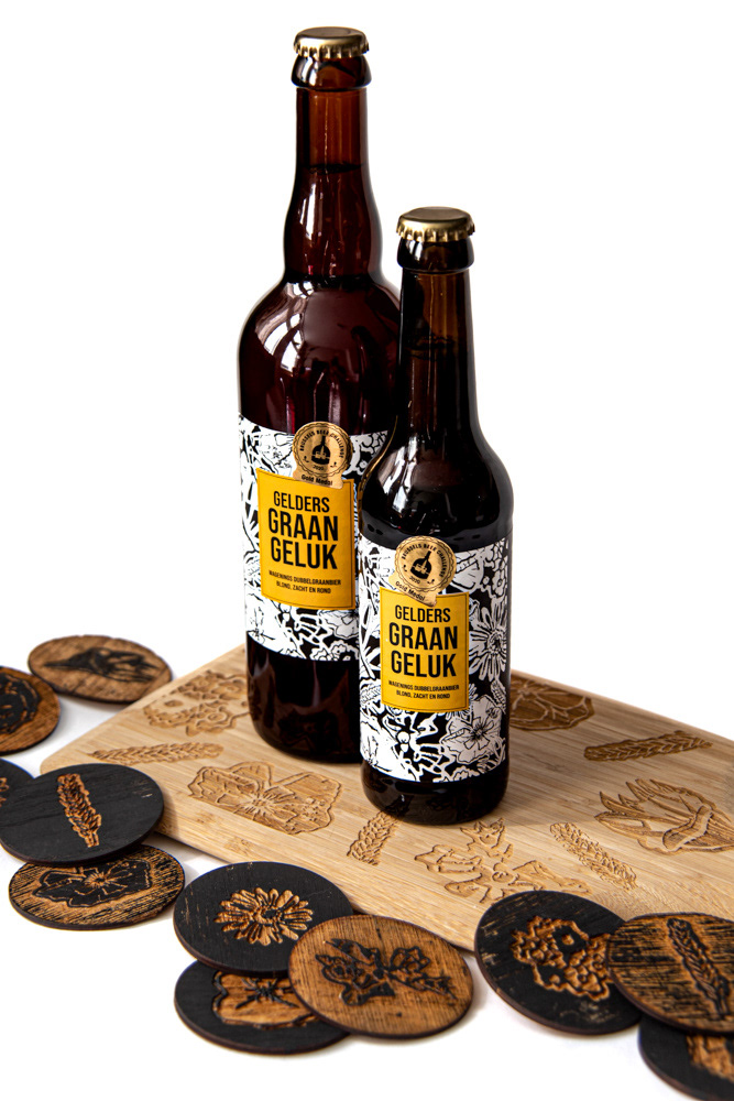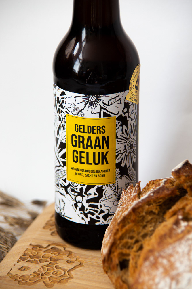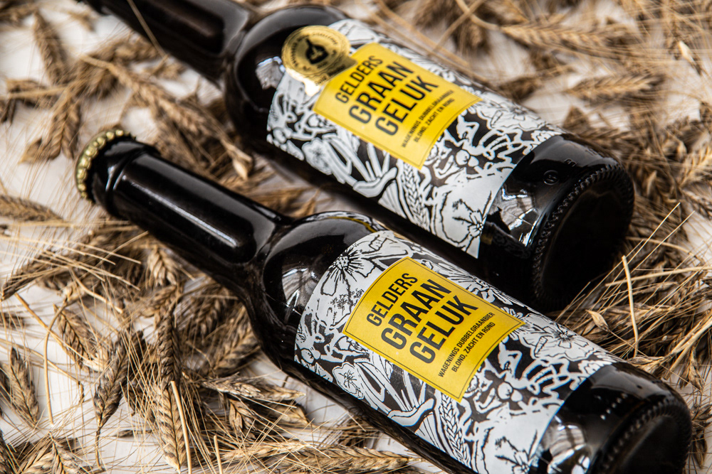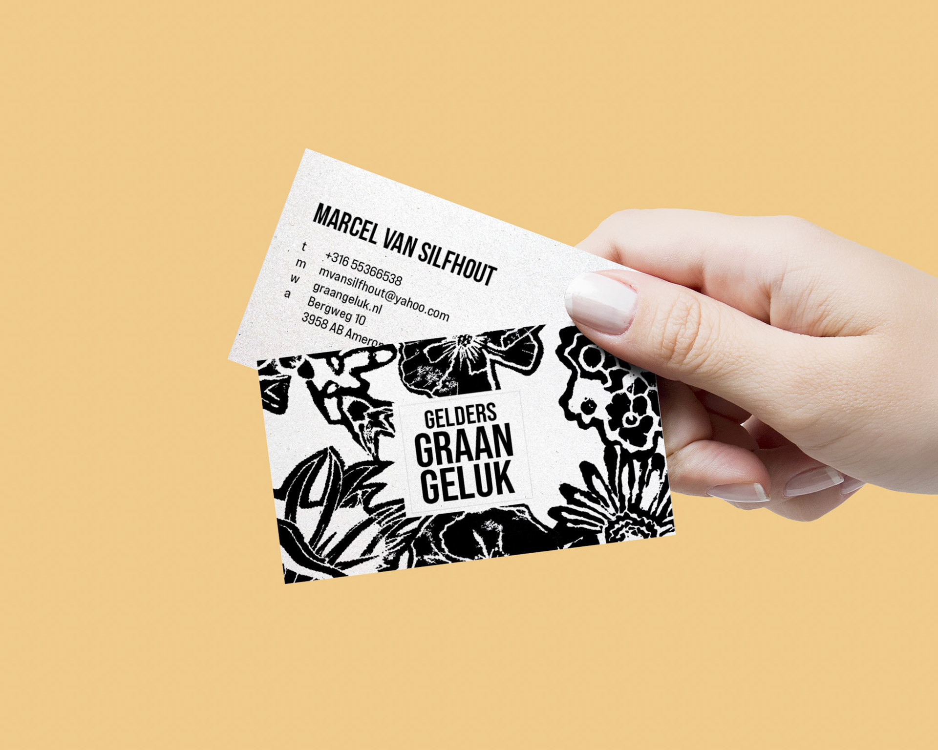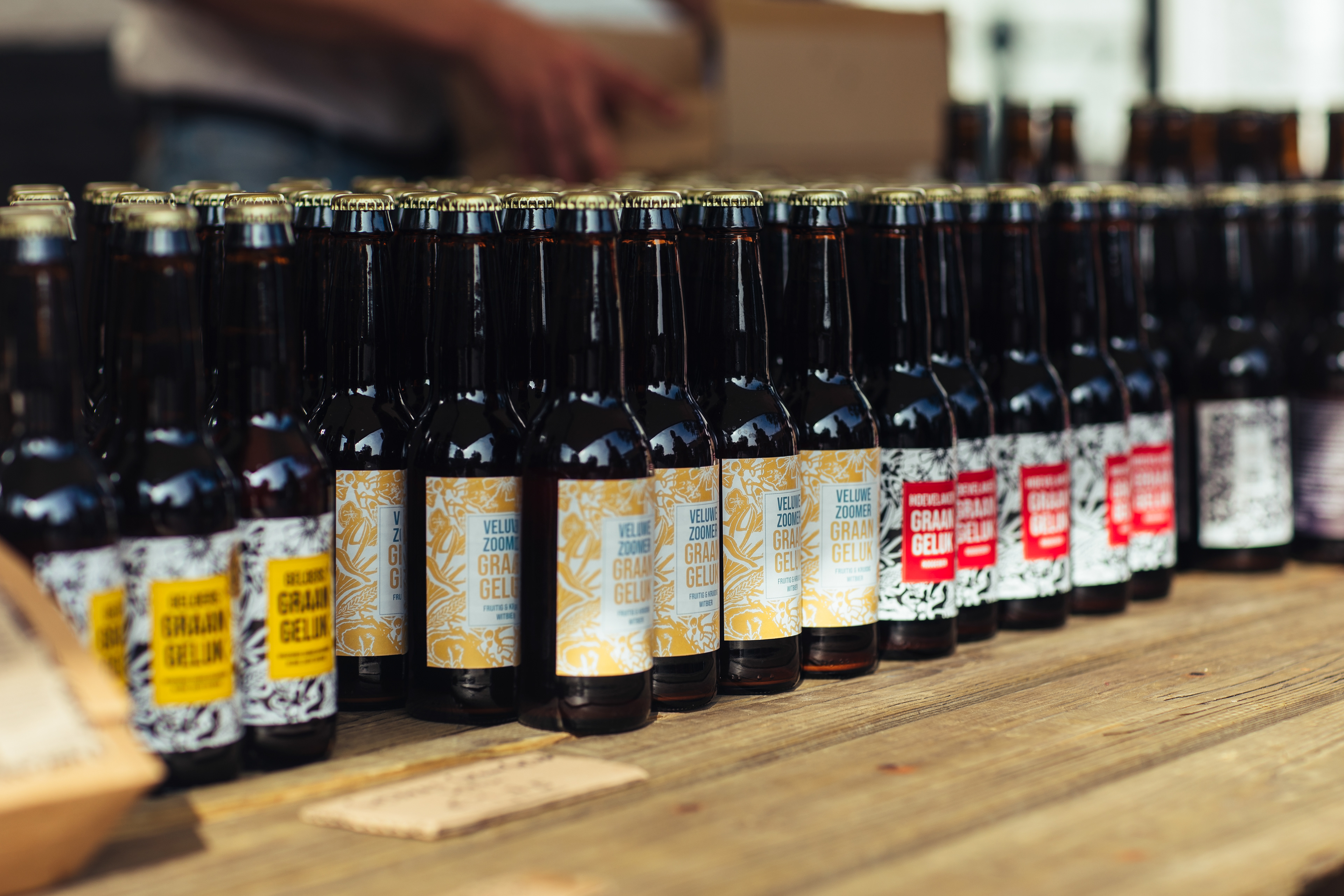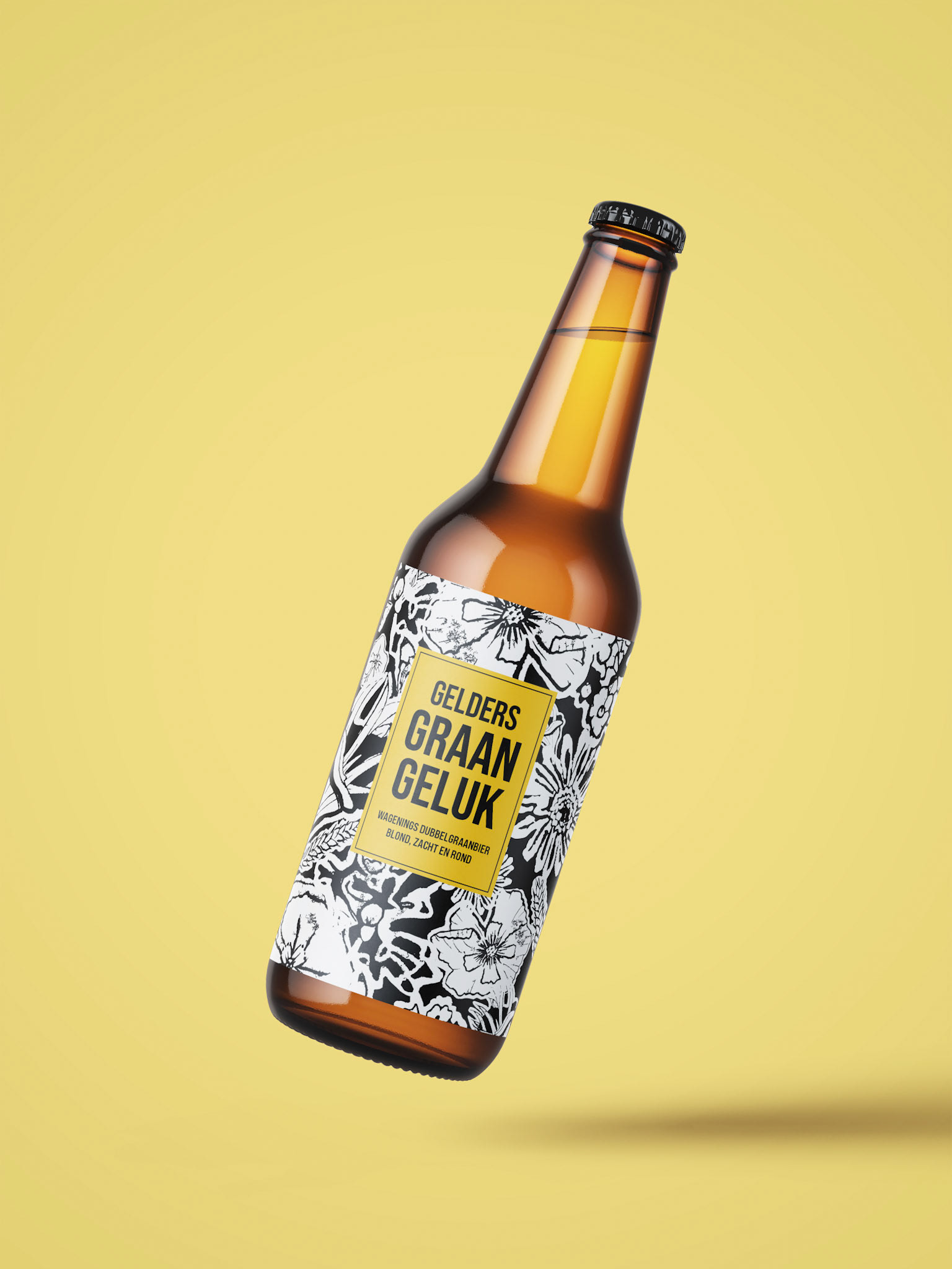
The journey of creating the GraanGeluk beer label was an inspiring one that kicked off with a deep dive into the very essence of their mission. To craft a label that showed their vision, I started by examining photographs of the native flowers that grow in the fields they cultivate alongside rare grasses. These fields are home to a diverse array of Dutch endangered field grasses, including pale yellow hemp nettle, spurge, felt, maple, and bell mirror.
My idea and branding for GraanGeluk's label reflect their goal to restore the fields naturally and promote biodiversity. It's all about showing the connection between the old grains and these field flowers. The label tells a story of nature and balance.
By featuring these special flowers on the label, I want to celebrate them and help people understand why supporting GraanGeluk is important. With each sip of their beer, you not only enjoy the taste but also support a mission to protect our environment and biodiversity.
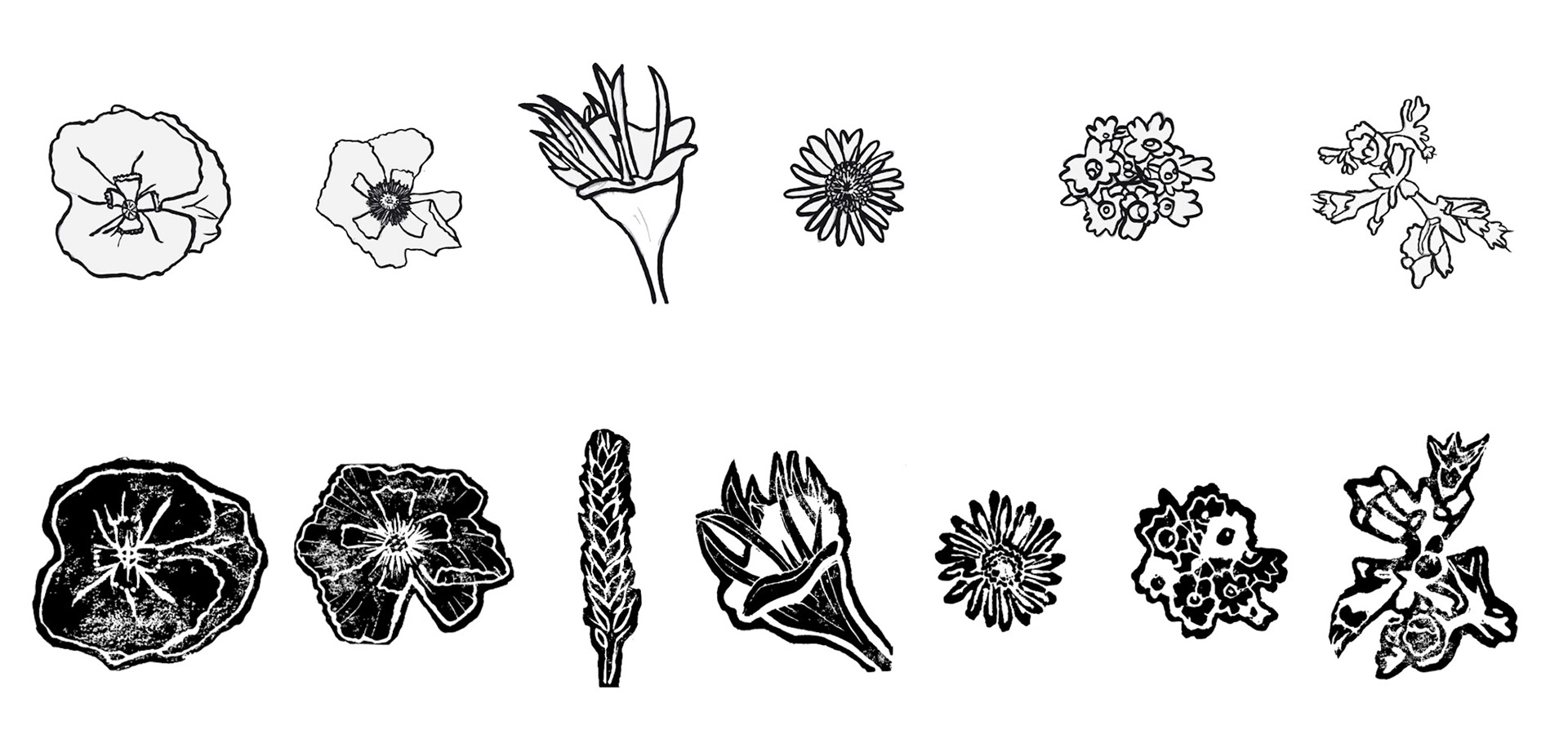
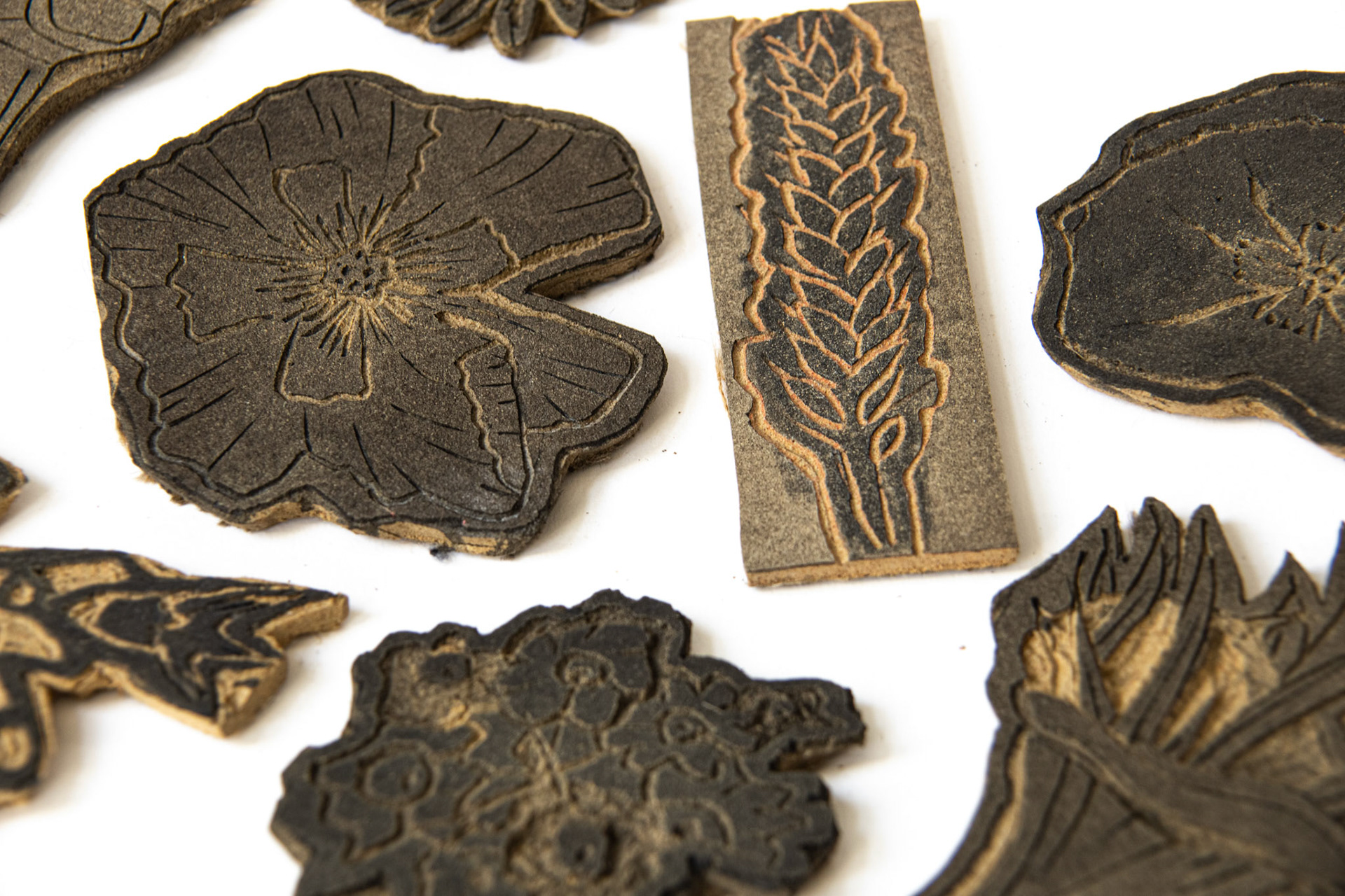
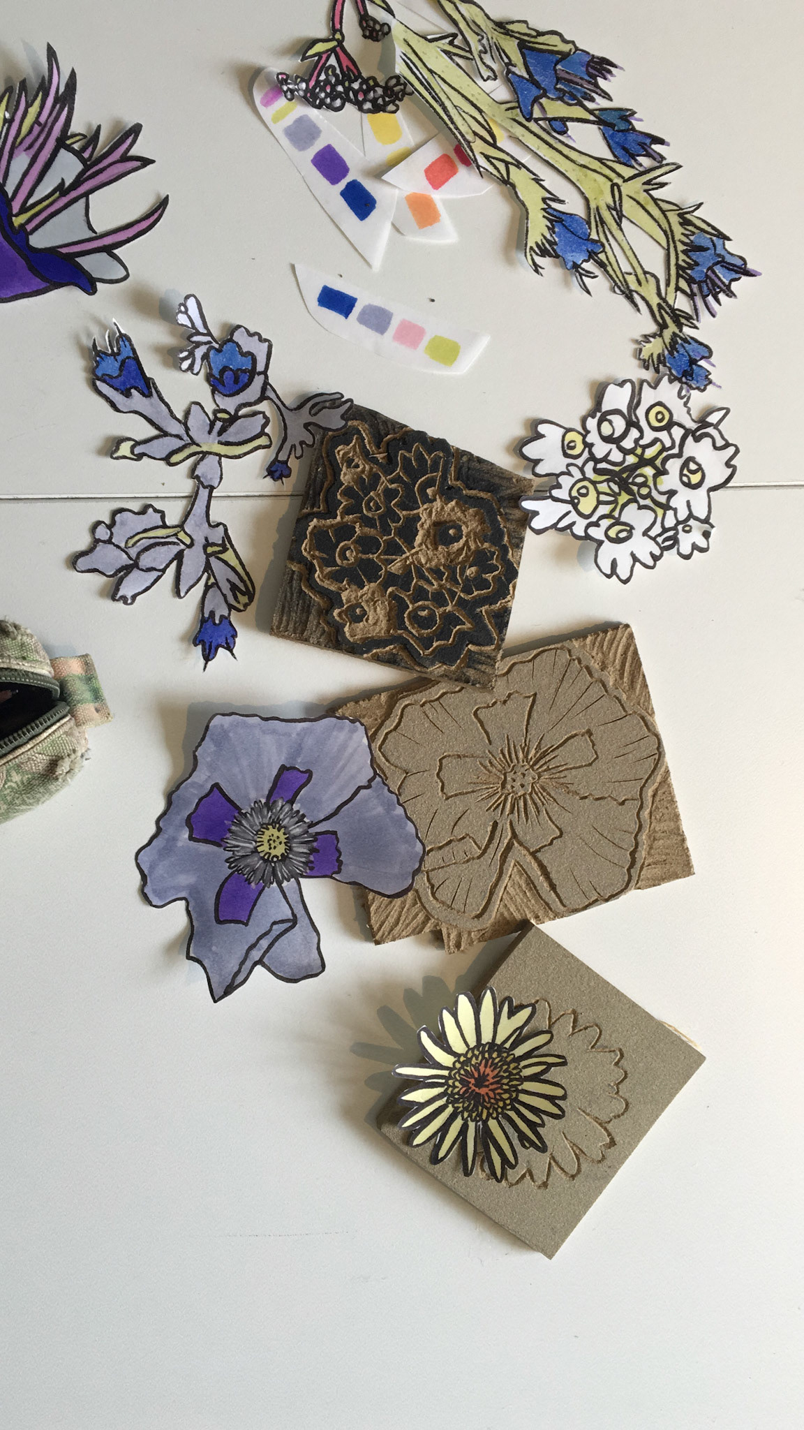
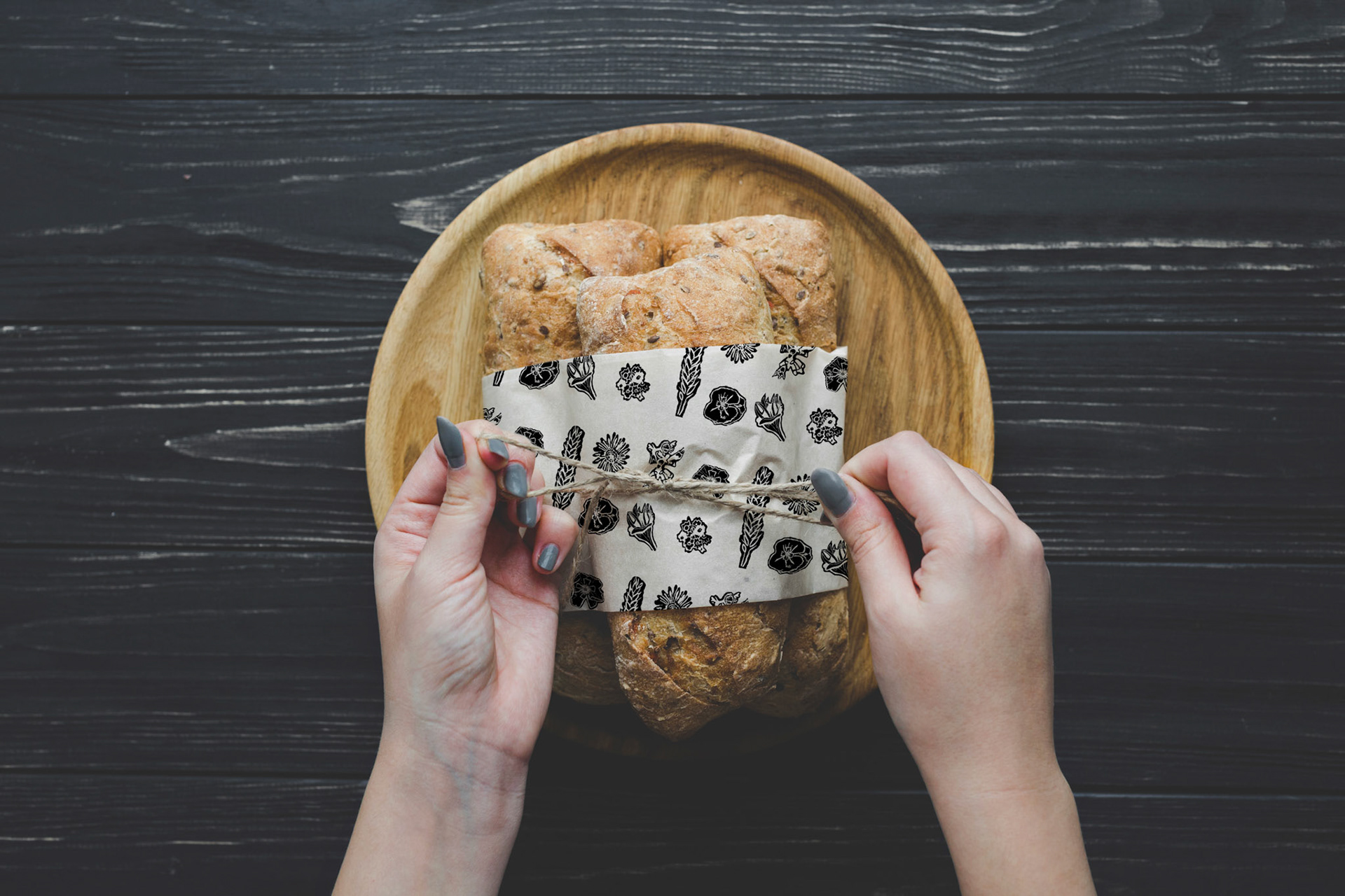
To capture the essence of these special flowers, I began by taking close-up photos and illustrating them. But, it didn't quite capture the look I envisioned. That's when inspiration struck. I decided to carve these flowers out of linoleum, giving them a more handcrafted, artisanal appearance. Which also fits the brand GraanGeluk. These flower carvings transformed into distinct and recognizable graphics, versatile enough to be used on the beer label and across all elements of GraanGeluk's branding. This was the beginning of GraanGeluk's branding journey, characterized by a natural, rustic, and traditional feel. These flower graphics can be used in different ways, like patterns or larger shapes. The linoleum style of the flowers adds a dynamic touch to the branding, making it stand out and easily recognizable.